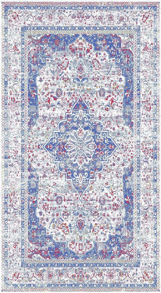
Claremont 3210 Neutral Area Rug
$280.00
Collection
Please choose
Size
Please choose
In stock: 5 available
Save this product for later
Claremont 3210 Neutral Area Rug
Product Details
Brand: Claremont
The pattern hierarchy begins with a central medallion and border rendered in a faded multicolor palette, while multitone neutral regulates depth from one passage to the next, throughout a color-washed transitional area rug with a measured decorative presence. Here, the treatment of a central medallion and border rendered in a faded multicolor palette produces a painterly rhythm which keeps the design expressive but furniture-friendly. The multitone neutral palette helps bridge warm and cool finishes without exact color matching. In frieze construction, the multitone neutral surface adds visible yarn texture and relaxed surface depth. Its thick profile gives the rug a stronger, more grounded furnishing presence, complementing the color-washed transitional direction of the design. As a finished furnishing, the rug delivers a confident but controlled decorative presence; for shoppers seeking a multitone neutral color-washed transitional area rug, that balance is a meaningful advantage.
How It Enhances the Space: For a professionally resolved open-plan family room, set a consistent boundary around the main furniture grouping. To carry the color through the room, reference multitone neutral sparingly and allow neutral upholstery or natural materials to balance it. For the strongest visual relationship with the furnishings, allow some of the moving field to remain exposed beyond the largest furnishings. The completed room achieves a more resolved balance between furniture, finishes, and open space.
Powered by Lightspeed
Display prices in:USD