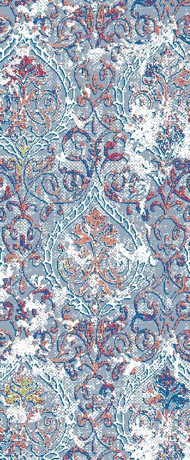
Claremont 3201 Platinum Area Rug
$280.00
Collection
Please choose
Size
Please choose
In stock: 4 available
Save this product for later
Claremont 3201 Platinum Area Rug
Product Details
Brand: Claremont
The eye is initially drawn to a scrolling paisley-like pattern softened by distressed color, and the platinum grey palette determines how firmly the detail stands forward, throughout a color-washed transitional area rug with a measured decorative presence. Here, the treatment of a scrolling paisley-like pattern softened by distressed color produces a painterly rhythm and that restraint gives the pattern a more mature read. The platinum grey color story keeps the surface cohesive while allowing surrounding finishes to contrast. In frieze construction, the platinum grey surface builds extra body into the field through textured yarn. Its thick profile gives the rug a stronger, more grounded furnishing presence, complementing the color-washed transitional direction of the design. From a rug-specialist perspective, the design combines visual character with the versatility needed for long-term room planning; for shoppers seeking a platinum grey color-washed transitional area rug, that balance is a meaningful advantage.
How It Enhances the Space: In the open-plan family room, organize circulation around a single, connected furniture arrangement. For controlled color repetition, borrow a single tone from platinum grey and let contrasting materials supply the rest of the depth. For the strongest visual relationship with the furnishings, leave enough expressive floor area visible for the movement to remain readable. The overall arrangement feels connected, comfortably scaled, and deliberately furnished.
Powered by Lightspeed
Display prices in:USD